People making a website decision
Owners, marketing leads and commercial teams who need to understand whether their website needs clearer messaging, better journeys, stronger search foundations or a rebuild.
 Social content studio
Fresh & Crispy / Public brand system
A practical reference for making Fresh & Crispy work look and sound consistent. It covers the public website, campaigns and social content. The internal Growth Engine has a separate interface system.
Fresh & Crispy is a website audit and rebuild studio for UK service businesses. We use a scored CRISP audit to show what helps a website, what gets in the way and what to fix first. When the evidence supports further work, our team can implement the fixes.
Owners, marketing leads and commercial teams who need to understand whether their website needs clearer messaging, better journeys, stronger search foundations or a rebuild.
The audit gives the reader a score, priority issues and a useful next step. It should remain valuable whether they fix the work themselves, use their current supplier or hire us.
We connect diagnosis with delivery. Claims come from observable evidence, and recommendations explain the visitor impact before proposing a solution.
The work should feel engineered, with strong hierarchy and direct language. A little dry wit can help when the situation allows it.
Show the page, behaviour or source behind a finding. Label concepts and demonstrations clearly.
Every page, component and piece of copy should help someone understand, decide or act.
Repeat the same type, colour, spacing and annotation patterns. Let content create variety.
CRISP is Fresh & Crispy’s own website audit method. Always define it in that context and keep the five dimensions in this order.
Can a visitor instantly tell what the business does and what to do next?
Is the website fast and smooth, including on mobile?
Does the website guide visitors to the right product or service?
Is it easy to enquire, book or buy?
Does the experience feel credible enough for the decision being made?
Choose the surface before choosing tokens. The public website is the visual source of truth. Social adapts it for fixed-size exports. The Growth Engine stays operational and separate.
Near-black and cream surfaces, acid emphasis, condensed display type and mono annotations. Use the live tokens in assets/css/v2.css.
Use the same dark, cream and acid character with square layouts. Arial replaces Inter for dependable offline export. Use the social studio templates.
A separate light and green interface for repeated operational work. Do not bring its compliance states, queue patterns or colours into public marketing.
The public palette uses warm neutrals with one acid accent. Dark and cream surfaces carry most of the work. Acid marks an action, score or deliberate point of emphasis.
--bg · oklch(12% .004 90)
#060605 equivalent--bg-2 · oklch(18% .004 90)
#121210 equivalent--ink · oklch(93% .017 95)
#EBE8DB equivalent--ink-soft · oklch(76% .014 90)
#B4B1A7 equivalent--accent · oklch(93% .23 125)
#C8FF3C export--paper · oklch(94% .018 94)
#EFEBDE equivalent--warn · oklch(72% .14 55)
#E78A45 equivalent--low · oklch(66% .17 25)
#E8605B equivalent| Role | Tokens | Use |
|---|---|---|
| Dark surfaces | --bg: oklch(12% .004 90) | Page, cards and nested surfaces |
| Dark text | --ink: oklch(93% .017 95) | Primary copy, supporting copy, metadata and low-emphasis labels |
| Rules | --line: oklch(24% .004 90) | Controls, frames and quiet section boundaries |
| Accent | --accent: oklch(93% .23 125) | Primary actions, hover, decorative emphasis and text on acid fills |
| Accent effects | --accent-wash: oklch(93% .23 125 / .13) | Status backgrounds, soft emphasis and rules on acid |
| Semantic | --warn: oklch(72% .14 55) | Warnings, errors and low scores, always with a written label |
| Light surfaces | --paper: oklch(94% .018 94) | Daylight sections, cards and their text hierarchy |
| Light rules | --paper-line: oklch(18% .009 90 / .14) | Borders and large accent details on paper |
--ink / --bg · 16.53:1--ink-soft / --bg · 9.46:1--accent-ink / --accent · 16.94:1--paper-ink / --paper · 15.79:1--paper-soft / --paper · 8.40:1--low / --bg · 6.04:1Do not use acid or deep green as body text on cream. Use near-black text on acid fills and pair every status colour with a written label.
Futura Condensed ExtraBold gives headings their compressed force. Inter, with system fallbacks, keeps longer text calm and readable. Monospace labels make evidence, scores and annotations feel precise.
Display / H1
41.6px to 86.4px
800 / .98 / +.01emSection / H2
29.6px to 49.6px
800 / 1.02 / +.01emCard / H3
22.4px
800 / 1.15 / +.02emLead
18.24px
400 / 1.6 / 56ch maxBody
16px
400 / 1.6Small
14.4px
400 / 1.6Annotation
11.52px
mono / +.08em / uppercaseKeep display headings short and uppercase. Use sentence case for body copy and interface labels. Do not redistribute the local font files until their licence permits it.
Use generous vertical rhythm, a visible grid and fine rules. Pages should feel measured rather than crowded. Borders and surface contrast create depth; shadows are reserved for content that needs to sit above the page.
space-1 · 4pxspace-2 · 8pxspace-3 · 12pxspace-4 · 16pxspace-5 · 24pxspace-6 · 32pxspace-7 · 48pxspace-8 · 64pxspace-9 · 96pxspace-10 · 120pxUse square edges for editorial layouts and exports. Use 8px to 16px radii for interactive controls, cards and framed media. Circles are limited to dots, avatars and compact indicators.
Use the supplied artwork without redrawing it. Choose white on dark surfaces and black on cream or white. Keep the mark level, preserve its proportions and leave enough space for the letterforms to breathe.
Use the cap height of the “F” as one unit. Keep at least one unit free on every side of the artwork.
Use a 26px logo height in navigation. Elsewhere, keep the full wordmark at least 64px wide on screen or 12mm wide in print. Below that size, use the approved favicon.
Use real interfaces, deliberate compositions and recognisable people. Images should prove the work, explain a principle or introduce the team. Stock technology scenes and decorative filler weaken the evidence-led position.
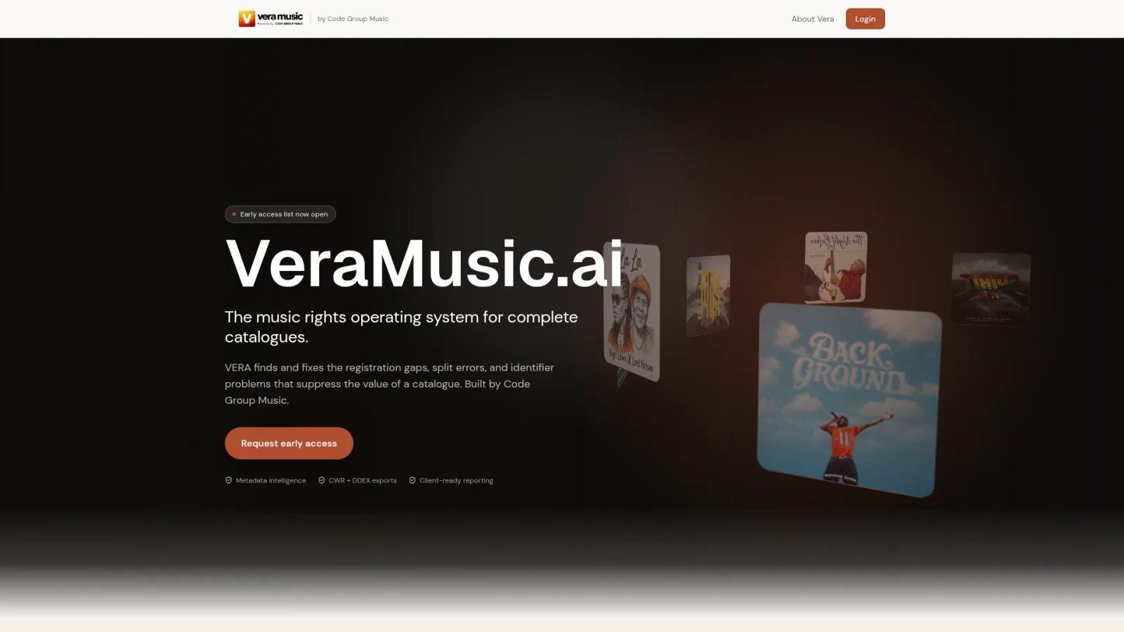
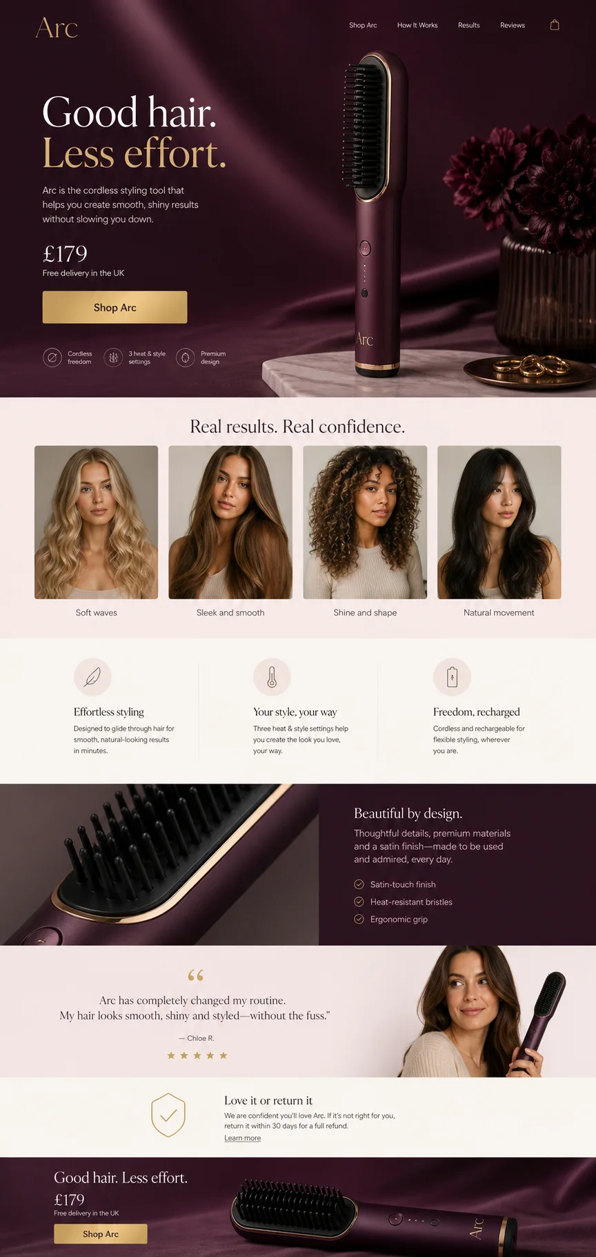

Components use the live website classes and tokens. Every control needs a visible label, a clear state and a specific action. Keep one primary action in each decision area.
Free. About 60 seconds. No obligation.
The button says “Learn more” and opens the services page. Name the service or next step so visitors know where the click leads.
Contextual, Responsive, Intelligent, Seamless and Powerful. Each dimension connects an observation to evidence and a practical priority.
| State | Required behaviour |
|---|---|
| Default | The label names the action or destination. |
| Hover | Change colour or border within 150ms. Keep layout stable. |
| Focus | Show a 2px acid outline with 3px offset. |
| Active | Use a brief 0.97 scale response. Remove the transform for reduced motion. |
| Disabled | Reduce emphasis, remove pointer behaviour and explain why when needed. |
| Error | Place a specific message next to the field and explain how to recover. |
Accessibility is part of the brand. Strong hierarchy, honest labels and visible states make the work feel considered. Every public pattern should work with a keyboard, at narrow widths and with reduced motion.
Use motion to show continuity, progress or response. Entries use opacity and a small 16px movement. Controls respond within 150ms. Structural sequences may run up to 800ms.
fast 150ms · base 300ms · slow 500ms · structural 800msUse the canonical ease-out curve: cubic-bezier(.16, 1, .3, 1). Remove transforms and looping motion when reduced motion is requested.
Our voice stays the same: plainspoken, observant, candid and human. Our tone changes with the reader’s situation. A homepage can be confident. An audit finding should be calm and exact. An error message should help someone recover.
Use the words you would choose when explaining the problem to a smart client. Keep technical terms when they add precision, then explain them in context.
Contractions are welcome. Buzzwords, jargon for show and inflated claims are out.
Point to the button, page, message or behaviour that needs attention. Name the consequence for the visitor and the next useful fix.
Specific observations carry more weight than adjectives.
Say what we know, how we know it and where the evidence stops. If a finding needs analytics, customer research or a technical check, say so.
We earn trust by being honest about limitations.
Write to “you” and use “we” for work our team does. Vary sentence length. Keep a little edge when it feels natural.
Dry wit is welcome when the reader is relaxed. Clarity always wins.
Start with what the reader is trying to do and how they are likely to feel. Keep the voice recognisable, then adjust the amount of energy, humour and detail.
| Moment | Reader needs | Tone | Example |
|---|---|---|---|
| Homepage | A quick reason to care | Confident, concise, specific | “See what is helping your website, what is getting in the way and what to fix first.” |
| Audit finding | A clear diagnosis | Calm, exact, evidence-led | “The main button says ‘Learn more’ and opens the services page. Name the service or next step so visitors know where the click leads.” |
| Error message | A way forward | Direct, reassuring, brief | “We could not check that URL. Check the address and try again.” |
| Support | To feel heard and get help | Warm, patient, practical | “That sounds frustrating. Send us the page URL and what you expected to happen, and we’ll take a look.” |
| Social post | One useful idea | Conversational, sharp, lightly playful | “‘Learn more’ is asking the visitor to do the writing. Tell them what they’ll get.” |
Lead with what the reader can understand, decide or do. Product names and process details can follow. These are illustrative rewrites; audit findings still need evidence from the website being reviewed.
Avoid: “Elevate your digital presence with transformative solutions.”
Use: “Get a scored CRISP audit with clear priorities for your website.”
Avoid: “Unlock the full potential of your customer journey.”
Use: “Check that your main button tells visitors what happens after they click.”
Avoid: “Begin your transformation.”
Use: “Book a call.”
Match the label to the destination. Explain any commitment before the reader takes the next step.
Use humour to make a useful point more memorable, never to decorate routine copy. Keep it dry, specific and inclusive. Skip it when someone is confused, blocked, worried about money or reporting a problem. If the joke needs explaining, cut it.
Informed by PostHog’s voice and tone guide, Mailchimp’s voice and tone guide and Peter Yang’s No AI Slop guide. Fresh & Crispy’s evidence and UK English rules apply throughout.
Start with the minimum set of recognisable brand elements for the surface. Keep the palette, type roles, grid and voice consistent, then let the content determine the composition.
[ 01 ] / THE PROBLEMRun these checks before a public asset ships. The boxes are a working review aid for the current browser session.
This page is the human-readable public-brand reference. The live stylesheet remains the implementation source for website tokens and components. Keep both aligned when the public system changes.
Brand changes need review against the production website, current evidence rules and the intended surface.
Website token changes begin in assets/css/v2.css, then regenerate the minified stylesheet and update this reference. Social changes also update the studio and its guide.
This page is available at /brand/ but remains noindex, excluded from the sitemap and blocked in the general crawler rules.