
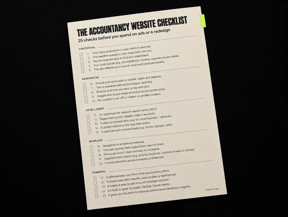
What is an accountancy website checklist for?
Your website has one commercial job: turn the people who find you, or who are sent to you, into consultations. For most practices that means business owners who were referred by a solicitor, a bank manager or another client, and who look you up that evening before deciding whether to call. This checklist tests the things that decide that moment.
The 25 checks are grouped under the five dimensions of the CRISP method: Contextual, Responsive, Intelligent, Seamless and Powerful. Work through them with a notepad, mark each one pass, fail or unsure, and note the page where you saw the problem. It is the accountancy-specific version of our general 12-point website audit checklist.
Contextual checks: can a prospect tell who you help?
These five checks test whether a first-time visitor understands what your firm does, who it is for and what to do next, within a few seconds of landing.
- Your homepage says who you help in one line. Why: "Accountants in Leeds" describes you, not the client. "Accounts, tax and advice for owner-managed businesses in Leeds" tells the right prospect they are in the right place. How to check: show the homepage to someone outside the firm for five seconds, then ask who it is for.
- Services are written around client problems. Why: a list of compliance tasks reads the same as every other firm. How to check: read each service page and count how many sentences start with "we" versus the client's situation.
- Advisory work has its own page. Why: if advisory is buried under "other services", the site mainly attracts price-shoppers for year-end accounts. How to check: can you reach a dedicated advisory page from the main menu in one click?
- Your location and service area are obvious. Why: many prospects want someone local, or at least someone who works with firms in their area. How to check: find your town and service area without scrolling to the footer.
- Every page has one clear next step. Why: three competing buttons usually means none gets clicked. How to check: on each key page, name the single action you want a visitor to take. Our post on how many calls to action a page should have goes deeper.
Responsive checks: does the site work on a phone?
Many referrals check you on a phone between meetings. These checks test speed and mobile usability, which Google also measures through its Core Web Vitals.
- Key pages load quickly on mobile. Why: a slow page loses people before they read a word. How to check: run your homepage and main service page through Google PageSpeed Insights and look at the mobile result.
- Your phone number is tap-to-call. Why: on a phone, a number that cannot be tapped is a small but real barrier. How to check: tap it on your own phone and see whether it dials.
- Key services are two taps from the homepage. Why: mobile menus often hide the most important pages. How to check: open the menu on a phone and time how long it takes to reach your main service page.
- Forms are easy to fill in on a phone. Why: tiny fields and the wrong keyboard make people give up. How to check: complete your own contact form on a phone, one-handed.
- Fee guides and brochures are pages, not heavy PDFs. Why: large PDFs are slow on mobile and hard to read. How to check: list every PDF linked from the site and note its file size.
If speed is the problem, why is my website slow explains the usual causes.
Intelligent checks: does the site route each client type?
A sole trader, a growing limited company and a landlord want different things from you. These checks test whether the site sends each one to the right place.
- Visitors can choose by client type. Why: people look for themselves before they look for a service. How to check: is there a clear route for each of your main client types from the homepage?
- Sector pages exist where you have real experience. Why: "We work with dental practices" is more persuasive than a generic services list, if it is true. How to check: list your top three sectors by fee income and see whether each has a page.
- Helpful content answers real client questions. Why: articles on deadlines and tax changes show expertise and bring in search traffic, but only while they are current. How to check: find your three most recent articles and check the dates and facts still hold.
- Search basics are in place. Why: if Google cannot understand your pages, referrals are the only way in. How to check: confirm each page has a unique title, your Google Business Profile is up to date, and the site is verified in Google Search Console.
- You explain how fees work. Why: prospects want to know whether you are in their range before calling. You do not need a price list, but saying how fees are set helps. How to check: can a visitor find anything about fees without contacting you?
Seamless checks: is booking a consultation easy?
This is where interest turns into an enquiry, or quietly does not. These checks test the contact path from click to reply.
- The contact form asks only what you need. Why: every extra field loses some people. How to check: count the fields. Name, email, phone and a short message is usually enough for a first contact.
- You say what happens after someone enquires. Why: "We will call you within one working day" removes doubt, as long as you keep that promise. How to check: read the text around your form.
- There is a way to book a consultation directly. Why: some prospects would rather pick a slot than wait for a call back. How to check: can a visitor book a time without sending a message first?
- The form actually reaches someone. Why: broken forms and unmonitored inboxes are more common than most partners think. How to check: submit a test enquiry and track where it lands and how long a reply takes.
- Enquiries are measured. Why: without tracking you cannot tell which pages bring in work. How to check: ask whoever manages your analytics whether form submissions and calls are recorded as events.
Powerful checks: does the site earn trust?
Accountancy is a high-trust purchase. These checks test whether the site looks as credible as the firm really is.
- Real team photos, names and qualifications. Why: people buy from people, and stock photos of handshakes do not help. How to check: can a visitor see who they would actually work with?
- Proof sits near the decision. Why: testimonials and short client stories work best on the service pages they relate to, not on a separate page nobody visits. How to check: look for proof on each main service page. Only use quotes you have permission to publish. Our post on whether testimonials increase conversions covers the detail.
- Professional body membership is shown correctly. Why: membership builds trust, and bodies such as ICAEW and ACCA set rules on how firms describe themselves and use logos. How to check: compare your wording and logos with your body's current guidance.
- Company and privacy details are complete. Why: a limited company must show certain details on its website, and missing ones look careless. How to check: compare your footer against the GOV.UK guidance on company details, and make sure your privacy policy and cookie notice are current.
- The design matches the fees you charge. Why: a dated or cluttered site makes a premium firm look like a budget one. How to check: put your homepage next to two firms you compete with for the same clients, and ask a client which looks most credible. Also check text contrast against the WCAG accessibility guidelines.
How to prioritise what you find
You will probably fail more checks than you expected. That is normal, and you do not need to fix them all at once. Start with failures in the Contextual and Seamless groups, because they affect every visitor on every page. Then fix mobile speed, then trust signals, then routing and content. Write down the date and your results before you change anything, so you have a baseline to compare against.
If you would rather not do this by hand, the free CRISP audit checks your site across the same five dimensions in about 60 seconds and gives you a score, a grade and the three fixes to make first. For more on how we work with practices, see our page on websites for accountancy firms.
Frequently asked questions
What should an accountancy firm website include?
At minimum: a clear line saying who you help, service pages written around client problems, a separate page for advisory work, real team profiles with qualifications, proof such as testimonials used with permission, an easy way to book a consultation, and the legal details a UK company must show. Everything else in this checklist makes those basics work harder.
How often should an accountancy firm review its website?
Run a light review every quarter and a full pass once a year, or after any big change such as a merger, a new service line, a new office or a senior hire. Websites drift quietly: team pages go stale, forms break after updates and speed slips as content piles up. A regular check catches this before prospects notice.
Can I check my accountancy website for free?
Yes. Every check in this list can be done with your own phone and free tools such as Google PageSpeed Insights and Google Search Console. If you want a scored starting point, the free CRISP audit from Fresh & Crispy checks your site across five dimensions in about 60 seconds and returns three priority fixes.
Do accountants need a good website if most work comes from referrals?
Usually, yes. Referred prospects still look you up before they call. The website either confirms the recommendation or gives them a reason to hesitate. A clear, credible site will not replace referrals, but it can stop good ones going cold before you ever hear about them.