
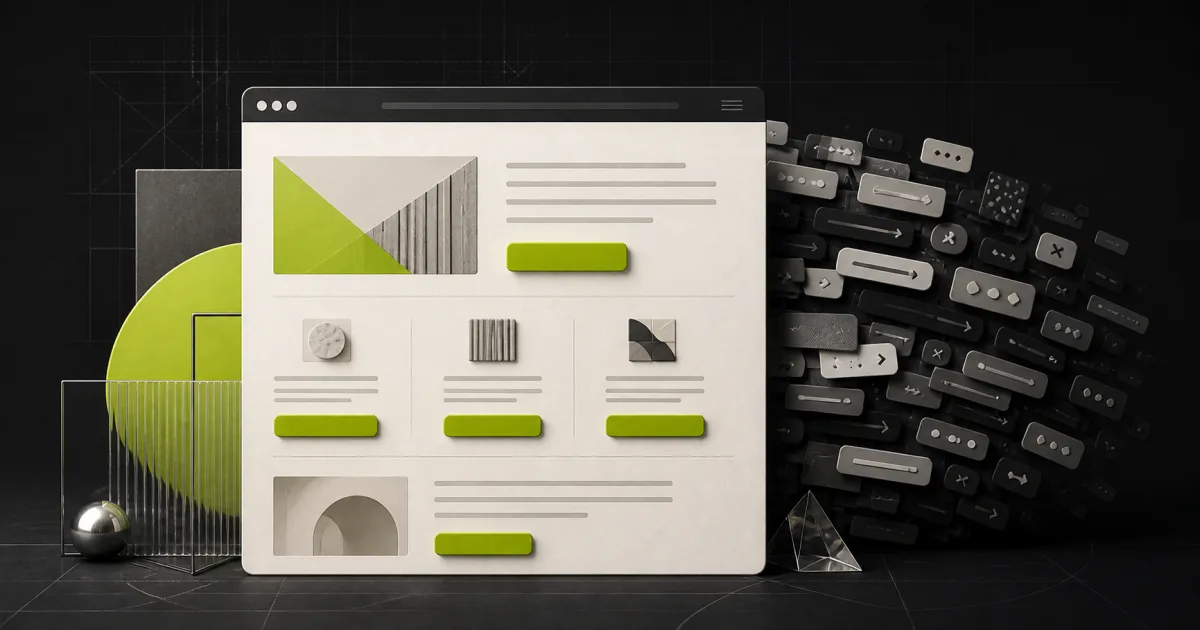
What is a CTA (call to action)?
A call to action is the point where a page stops informing and asks the visitor to do something: book a call, request a quote, submit a form, start a trial. It is usually a button, sometimes a link or a form, and it is the only part of the page that directly produces business. Everything else on the page exists to earn the moment when the CTA gets clicked.
Asking how many CTAs a page should have is really asking two separate questions, and conflating them is where most of the confusion lives. How many different actions should a page ask for? And how many times should the same action appear as the page scrolls? The answers are very different: as few actions as possible, repeated as often as the page earns it.
The one primary action principle
Every page should be able to complete the sentence "this page exists so that the visitor will...". One ending, not three. A service page exists to produce an enquiry. A pricing page exists to move people to the next step. When a page cannot complete the sentence cleanly, the design has no way to prioritise, and the visitor inherits the confusion.
The principle earns its keep at the moment of decision. A visitor at the point of acting has a small, fragile budget of commitment. Spend it on one clear ask and some of them act. Split it across "Book a call", "Download the brochure", "Follow us", and "Sign up for tips", each styled with equal enthusiasm, and the easiest choice becomes none of the above. This matters most on pages you pay to fill: it is the core argument for sending campaigns to dedicated pages at all, which we cover in landing page vs homepage, and it is the operating principle behind every landing page we build.
Primary versus secondary CTAs: the hierarchy that makes both work
One primary action does not mean one link on an otherwise dead-end page. Most pages legitimately need a secondary path for visitors who are interested but not ready: a link to pricing, a case study, a phone number for people who would rather talk. The rule is not "no alternatives". The rule is hierarchy.
The primary CTA gets the strong treatment: a filled, high-contrast button with wording that names the value, such as "Get your free audit score" rather than "Submit". The secondary gets deliberately quieter dress: a text link or a ghost button, physically near the primary but visually subordinate to it. A visitor glancing at the page should be able to answer "what does this site want me to do?" without reading anything. If the primary enquiry button and the newsletter signup wear the same outfit, the page has refused to answer, and refusing to answer is itself an answer visitors act on: they leave.
How many times should a CTA repeat down a long page?
Repetition of the same action is not clutter; it is courtesy. Visitors decide at different scroll depths. Some arrive convinced, some need the proof section, some read to the footer. A page with a single button at the top asks late deciders to scroll back up and hunt, and some will not.
The working pattern for a long service or landing page is three to five appearances of the same action: once in the opening screen for the already-convinced, once after the section that carries your strongest proof, and once at the end as the natural conclusion, with longer pages adding one after each major persuasive block. The rhythm that feels right in practice is an ask after each point where the page has just earned something. What matters is that every appearance is the same action, worded consistently. Five buttons asking for one thing is a rhythm; five buttons asking for five things is a committee.
What choice overload research says about too many options
The intuition that more options mean more chances to say yes is the most expensive intuition in web design, and it has been tested. In the widely cited jam study by psychologists Sheena Iyengar and Mark Lepper, shoppers offered 24 varieties of jam stopped to browse more often, but shoppers offered six varieties bought far more. Extra options attracted attention and then killed the decision. Later research has found the effect varies with context, but the practical direction for pages that want action is consistent: at the moment of choice, fewer options convert attention into decisions more reliably.
Usability research points the same way. Nielsen Norman Group's article Simplicity Wins over Abundance of Choice reports users preferring and performing better with pared-down option sets, and NN/g's studies of how users read on the web show visitors scanning rather than weighing pages carefully, which means every additional call to action is not evaluated so much as collided with. A scanning visitor who hits three competing asks does not deliberate. They defer, and on the web deferral means departure.
Where to place CTAs on the page
Placement follows a simple rule: put the ask where a decision has just become possible. In practice that means four positions earn their keep. The opening screen, because a minority of visitors, often returners, arrive ready and should not have to scroll. Immediately after your strongest proof, because the moment a named testimonial or a specific result lands is the moment belief peaks, and the button should be within reach of it. After objections are answered, such as pricing or process sections, where hesitation has just been addressed. At the end, because a visitor who read everything and finds no ask has been walked to the door and abandoned.
Two placement mistakes recur. Buttons stranded mid-decoration, between sections where nothing persuasive has just happened, train visitors to ignore them. And asks placed before any value is established, like a pop-up demanding commitment on arrival, read as pushy precisely because no decision has become possible yet.
Common CTA mistakes and what they cost
| Mistake | What the visitor experiences | The fix |
|---|---|---|
| Several actions styled equally | A choice between your priorities, so they make none | One strong primary, quieter secondary |
| Vague labels ("Submit", "Learn more") | Effort requested, value unstated | Name the value: "Get your free audit score" |
| One CTA at the top only | Late deciders must scroll back and hunt | Repeat the ask at each decision point |
| Different wording for the same action | Three labels read as three different offers | Consistent wording page-wide |
| CTA far from the proof | Belief peaks with no button in reach | Place an ask directly after strongest proof |
| Ask before any value is shown | A stranger demanding commitment | Let the page earn the ask first |
Most underperforming pages we audit commit two or three of these at once, and they compound: vague wording on competing buttons placed away from the proof is a page working against itself three ways simultaneously.
How to fix your own pages this week
Take your highest-traffic page and run the sentence test: this page exists so that the visitor will do what? Choose the one answer. Then demote everything else, rewrite the primary button to name the value the visitor receives, and repeat it after the opening screen, after the proof, and at the end. The whole exercise is an afternoon, and it is one of the few conversion changes that requires no new content, no developer, and no budget.
Then measure for a month before touching anything else, because a change you cannot attribute is a lesson you cannot learn. That discipline, one change, one measurement, is the core of honest conversion optimisation, and our guide to what conversion rate optimisation is sets out the full cycle behind it. If you would rather start from evidence than instinct, the free audit scores how clearly your pages ask for action, alongside the other jobs a page can fail at, in about a minute.
Frequently asked questions
Is it bad to have two different CTAs on one page?
Two different actions are fine when one is clearly primary and the other is visually quieter, such as a bold enquiry button paired with a text link to pricing. Two actions given equal weight is where pages go wrong, because the visitor has to choose between your priorities as well as their own. Decide which action the page exists for and dress the other one down.
Should the CTA button text be the same every time it repeats?
Keep the action identical and the wording consistent, with small variations allowed to fit the surrounding context. Repeating the same destination under slightly different labels, like Get started, Book now, and Contact us, reads as three different offers and makes visitors hesitate. If every button leads to the same enquiry form, the safest pattern is near-identical wording that names the same value each time.
Where should the first CTA appear on a page?
In the opening screen, before any scrolling, paired with the headline that explains the offer. A minority of visitors arrive ready to act, often returners, and the early button serves them immediately. Everyone else simply scrolls past it, at no cost. The mistake is not the early ask itself but making it the only ask, stranded far from the proof that persuades people.
Do more CTA buttons increase conversions?
More repetitions of the same action at sensible intervals generally help on long pages, because a decision can happen at any scroll depth. More different actions generally hurt, because each new option competes with the others for the same moment of commitment. The distinction matters: repeat one ask as the page earns it, and resist adding new asks alongside it.