
Make the promise match
The headline, evidence and call to action reflect the advert, email, search or referral that brought the visitor there.

By problem
Industries
 Our workSee all projects
Landing page design · strategy to launch
Landing page design is how we turn a campaign, a focused service or a new offer into one page with one job. Fresh & Crispy shapes the message around the traffic you are paying for, designs and builds the page responsively for UK businesses, and defines what gets measured before launch. Scope is agreed in writing before work begins.
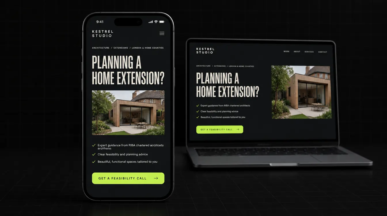
Your adverts are probably fine. The page they land on is doing the damage.
A landing page is the page paid traffic actually lands on, and it is where campaign budget is often quietly lost. Someone clicks an advert about one specific problem, then arrives on a general homepage and has to rebuild the pitch for themselves. Most will not bother. A focused page continues the conversation the advert started. It is also one stage in a longer journey, which is why we often plan it alongside the wider sales funnel it sits in.
Good landing page design is less about a striking first screen and more about answering the right questions in the right order. These four principles shape every page we build.
The headline, evidence and call to action reflect the advert, email, search or referral that brought the visitor there.
Benefits, proof, objections and conditions appear in the order a real buyer is likely to need them.
Every section points to the same next step. Extra navigation and competing offers are removed unless they genuinely help the decision.
Forms, bookings and relevant interactions are defined before launch, so later decisions can be based on evidence.
A landing page is not always the answer. Here is how we decide, and we will tell you if the evidence points elsewhere.
Still weighing it up? Our guide to landing pages versus homepages explains why campaign traffic usually needs its own page, and how many calls to action a page should have covers one of the most common mistakes.
Five original concept directions
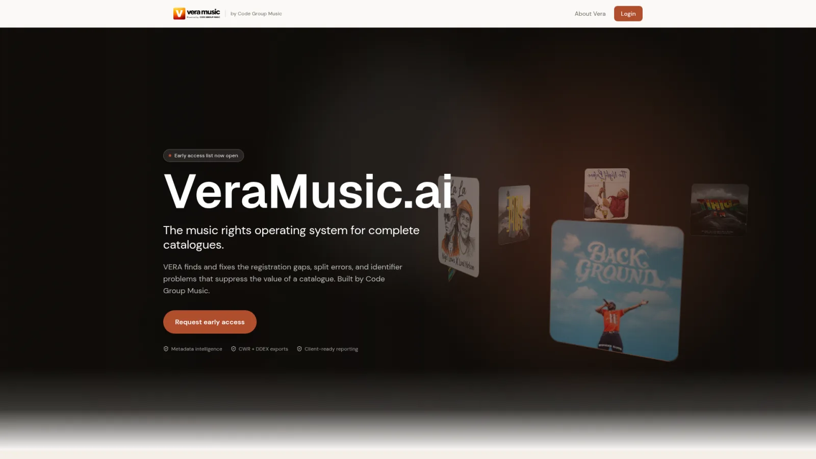
These are fictional design concepts created to demonstrate range, not client case studies or performance claims. Open any concept to inspect the full page.
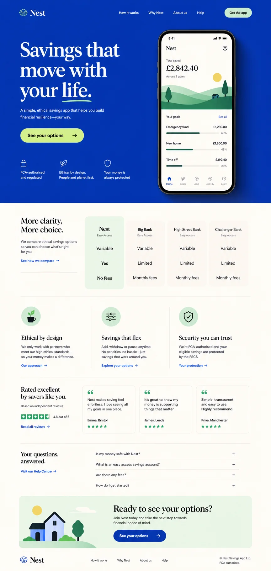
Calm reassurance, product clarity and a low-friction next step.
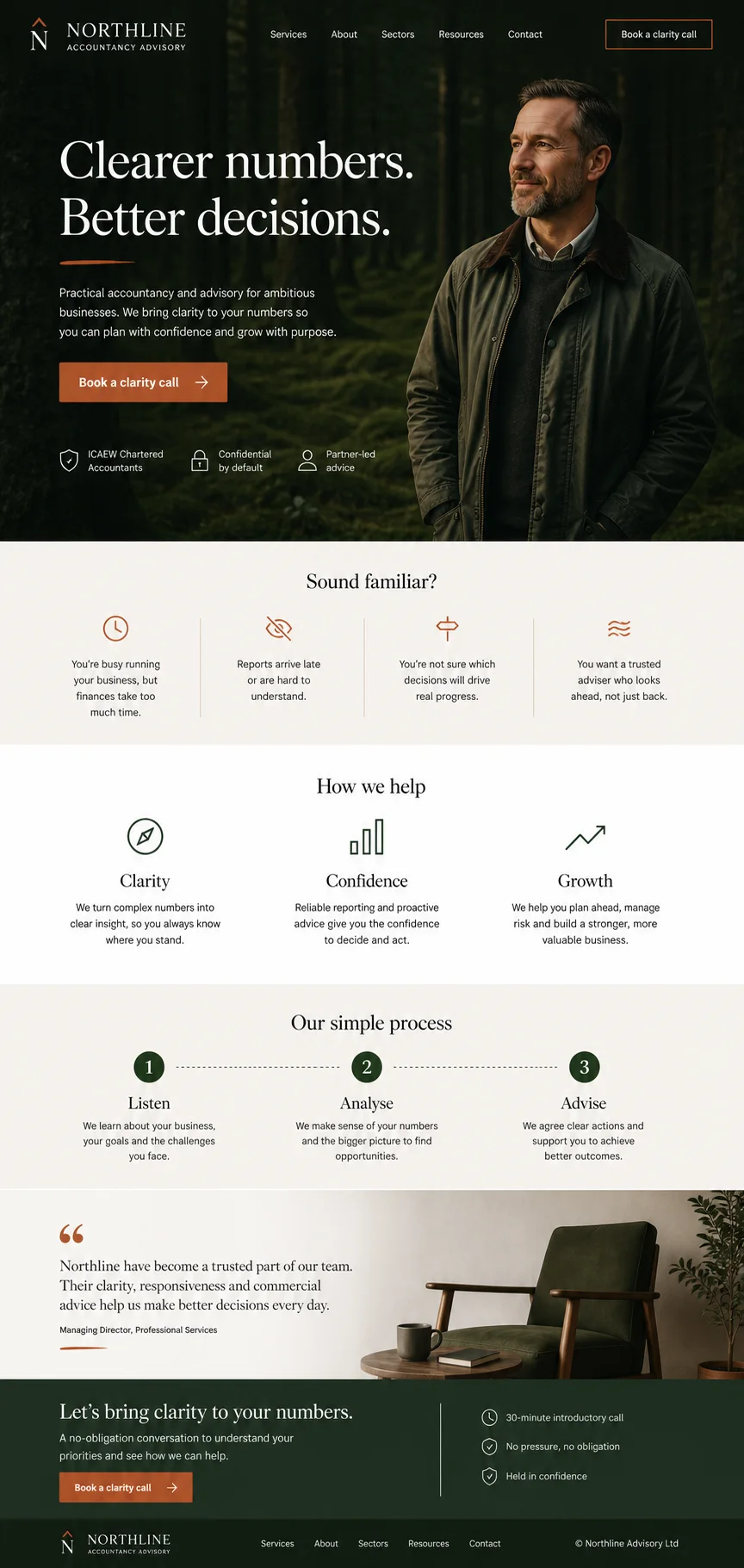
Professional confidence, clear problems and a human invitation to talk.
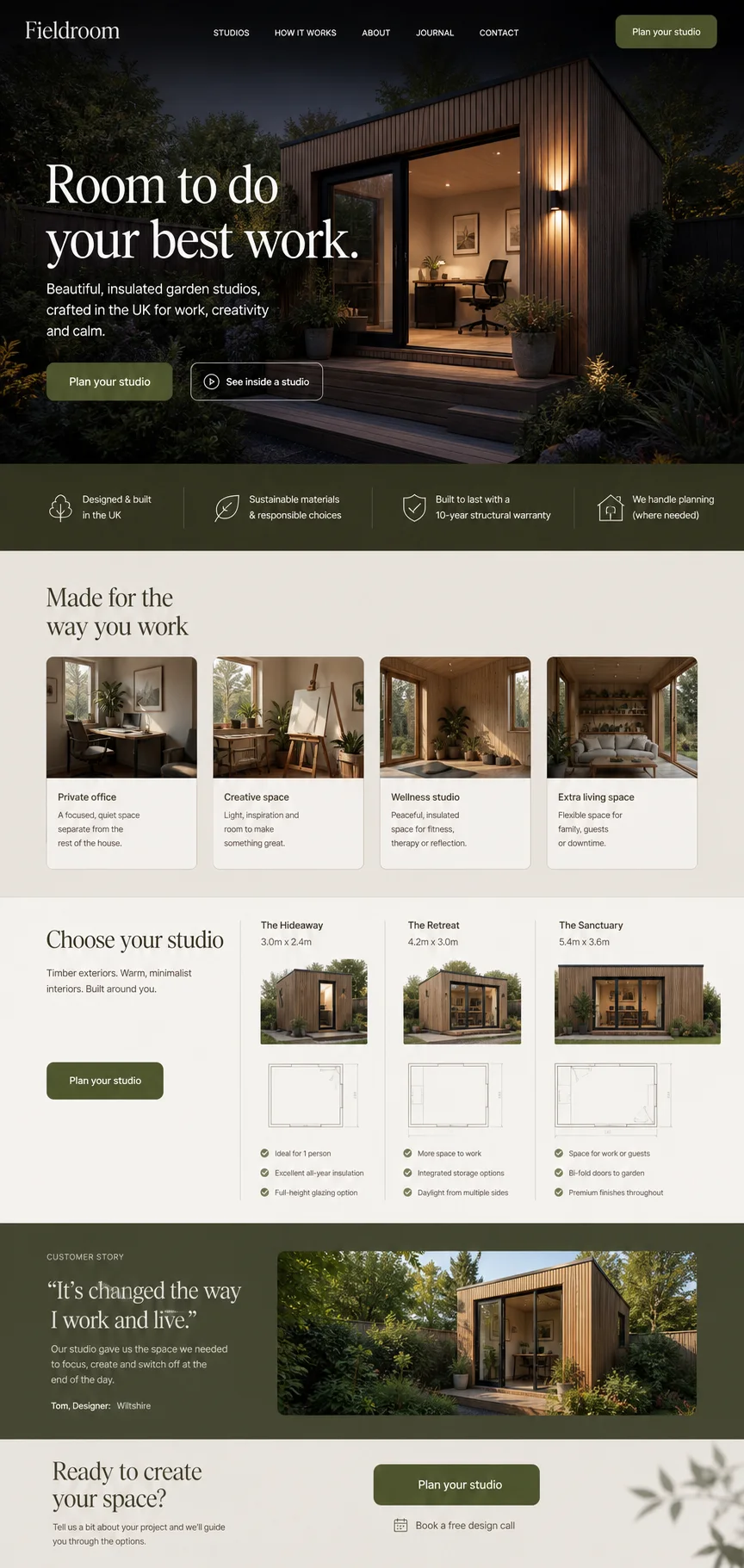
Aspirational imagery supported by practical choices and clear specifications.
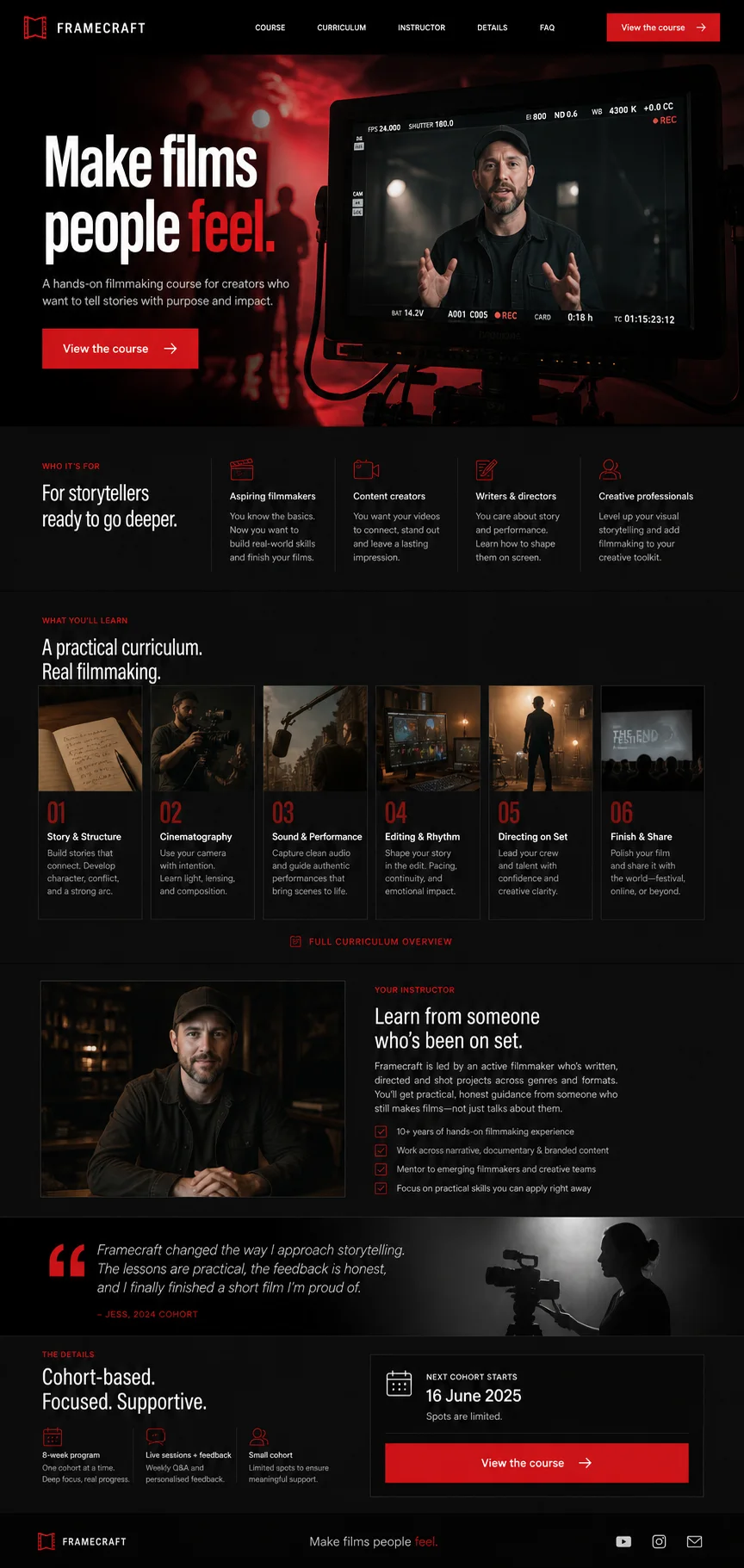
A bold promise, tangible curriculum and credible instructor context.
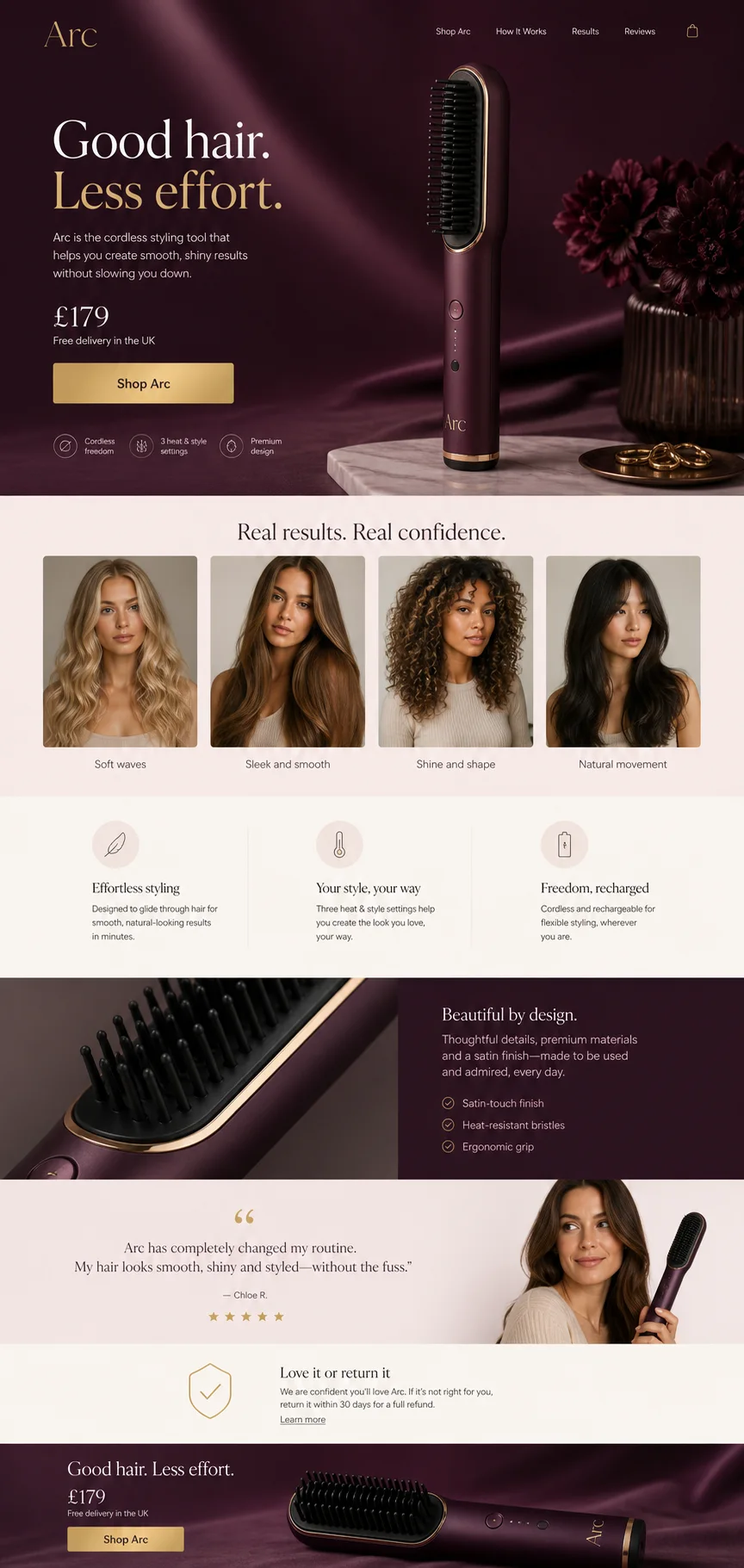
Premium product focus, visible outcomes and a repeated buying route.
The page is designed as a complete decision journey, then built to work across devices. The exact scope is agreed before work begins, including what you supply and what we write.
See how pricing is scoped →How long should a landing page be? Long enough to support the decision, and no longer. A familiar, low-risk offer may need a short page. A new, expensive or considered purchase needs more explanation, more proof and more objection handling before anyone will act.
A page builder is fine for a quick test. When real budget is behind the traffic, the thinking behind the page matters more than the tool.
| What matters | Fresh & Crispy | Typical agency | DIY / template |
|---|---|---|---|
| Starting point | The traffic source, the offer and the objections | Brand guidelines and a layout | A template you pick |
| Message match | Headline written to continue the advert or email | Often reuses homepage copy | Up to you |
| Proof | Placed next to the decision it supports | A logo band near the footer | Whatever you have to hand |
| Tracking | Events defined before launch | Often added after launch, if at all | Default page views |
| Scope | Written, with exclusions, before work starts | A package, extras found later | A monthly subscription tier |
| After launch | Improvements based on adequate data | New campaign, new page | Guesswork |
Generalised comparison, not a claim about any named agency.
The structure of the page is agreed before anyone argues about colours. That is where most of the value is, and where changes are cheapest.
Clarify the audience, traffic source, offer, evidence, objections and intended action. If a page already exists, the free CRISP audit shows where it is weakest.
Output: brief and written scopeTurn the brief into a clear page sequence with the right proof near each decision, and agree the copy approach.
Output: wireframe and page argumentCreate the visual design, responsive page, forms and agreed integrations, reviewed at each stage.
Output: working page on your platformTest the journey and tracking before launch, then use adequate data to identify sensible improvements.
Output: checked launch and measurement planRead the full working process. If the page already has meaningful traffic, it can be paired with conversion optimisation, and our guide to what a good conversion rate looks like sets sensible expectations.
The questions people ask before they commit budget to a landing page. If yours is missing, ask it on a call.
There is no fixed price, because the work depends on the offer, how much copy is needed, the design, the build and the integrations involved. A single campaign page on an existing platform is a very different job from a new page with booking and CRM connections. The proposal states what is included, what is excluded and the pricing basis before anything starts. Our pricing page explains the factors.
It depends on how clear the offer is, whether copy is ready, the platform it has to live on and how quickly feedback comes back. We will not promise a date before we understand those. The proposal sets out the stages and review points, so you can plan the campaign launch around real milestones rather than a hopeful guess.
Pages usually fail for knowable reasons: the headline does not match the advert, the offer is unclear, proof sits in the wrong place or the form asks too much. We start by finding which of those applied last time. If the existing page is worth fixing rather than replacing, we will tell you, and a conversion review may be the cheaper route.
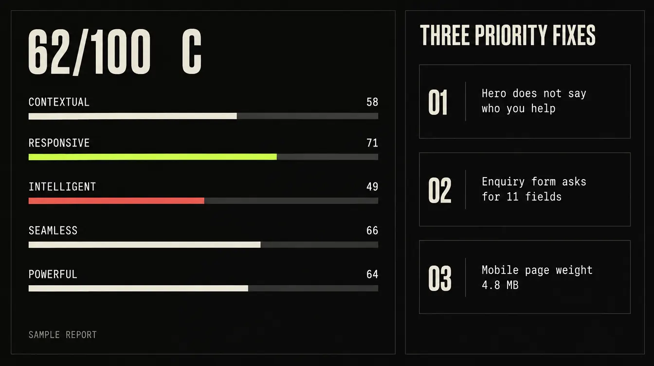
No, but it helps if you already have a page that is not performing. The free audit takes about 60 seconds, scores the page across five dimensions and returns three priority fixes, with no obligation to buy anything. If you are starting a new campaign from scratch, book a 15 minute call to talk through the traffic, the offer and the action instead.
No. Traffic quality, offer strength, price, competition and your sales follow-up all affect performance, and nobody controls all of them. What we can do is remove the friction we find, apply relevant evidence to the page structure and define exactly how the page will be measured, so you can judge the result on data rather than opinion.
Ownership of the page, design files, copy and tracking set-up is written into the proposal before you commit. As a rule, your ad accounts, analytics and form tools should sit in your name, not a supplier's, so the data stays with you when the campaign ends. If they currently do not, we will flag it during the project.
Someone who can approve the offer and the copy, the adverts or emails that will send traffic, access to the platform the page will live on and any proof you have. Copy can be included: we agree up front whether you need a full draft, editing of supplied material or a collaborative approach, so nobody is waiting on words they did not know were theirs.
We check that forms, bookings and tracking fire as defined, then hand over. Once the page has enough traffic to read, the data shows where people drop off, and improvements can be based on that rather than taste. Ongoing optimisation is scoped separately, and you are never tied into a retainer to keep the page running.
We will help turn them into a focused page with a clear argument and a measurable next step. Already have a page that is underperforming? Score it first.
Not ready to talk? Read why a website is not converting for the usual culprits.